

B2B Website Engagement Software: Feature Comparison
Live chat, chatbots, popups, session replay, AI conversational agents the category is crowded, and the feature lists all start to...

 14 Mins Read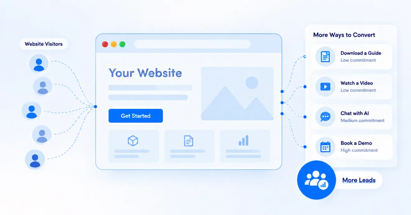
You don’t need a bigger ad budget to get more leads. You need your website to do a better job with the traffic it already has. Here’s a simple, practical guide to turning more visitors into leads, no ad spend required.
Let’s start with an uncomfortable truth. Most businesses spend money getting people to their website, and then just… hope. They hope visitors will find the pricing page. They hope they’ll fill out the contact form. They hope they’ll email instead of leaving.
Hope is not a strategy. And the good news is, you don’t need to spend a single extra rupee or dollar on ads to fix this. You just need to fix what happens after someone lands on your site. That’s what this guide is about.
We’ll walk through this step by step, in plain language, with real things you can do this week. No jargon, no fluff. Grab a coffee and let’s get into it.
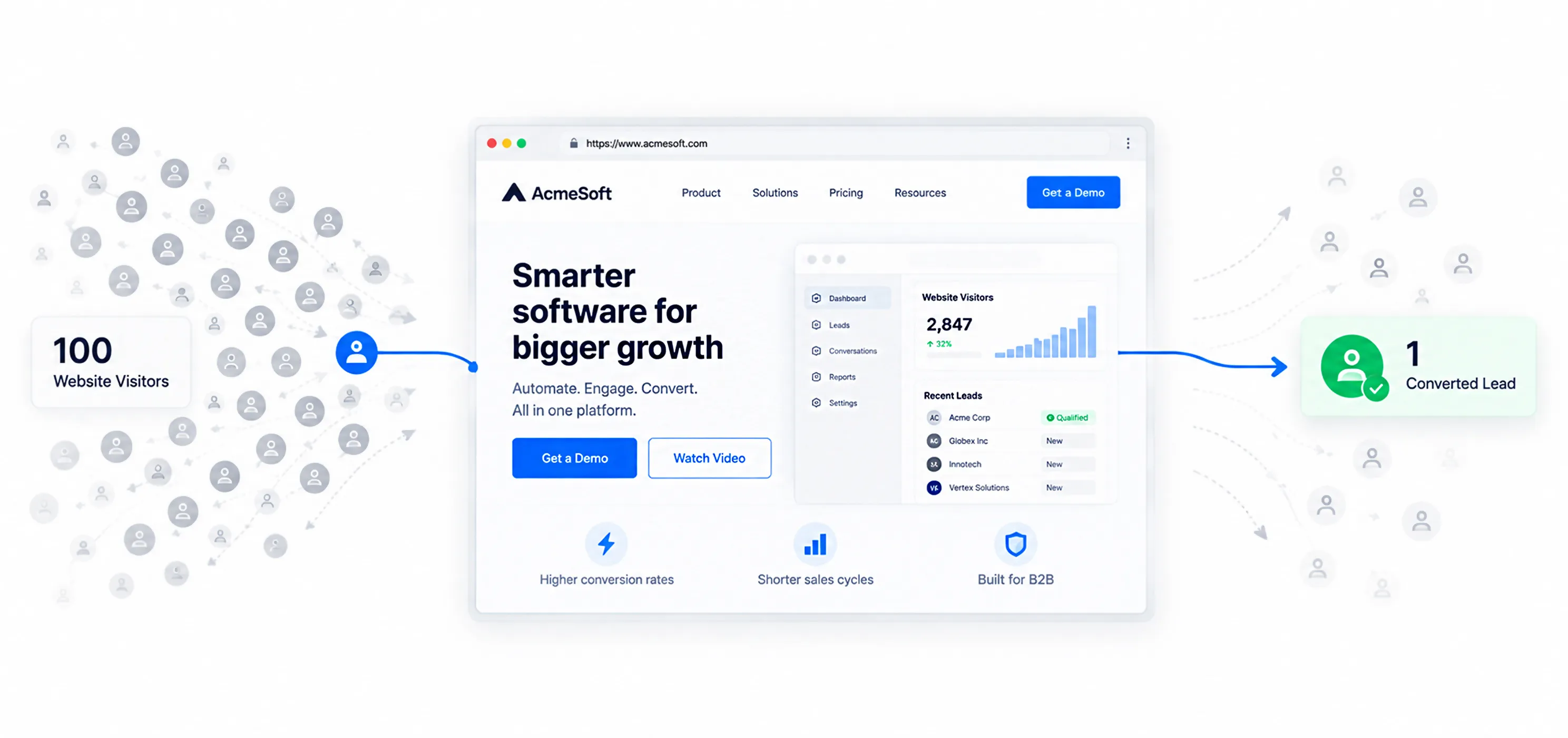
Before we fix anything, let’s agree on what we’re fixing. A “lead” is simply someone who has told you they’re interested by giving you their email, phone number, or by starting a conversation with you. “Conversion” is the percentage of website visitors who become one of these leads.
Here’s the number that should keep you up at night: on most websites, fewer than 1 in 100 visitors ever convert into a lead. The other 99 show up, look around, and vanish. They never call. They never fill out a form. You never even know their name.
| Think of it this way: if 1,000 people walked into your physical store every month and only 5 to 10 of them ever spoke to a salesperson, you’d consider that a serious problem worth fixing immediately. Yet most businesses accept this exact scenario happening on their website without blinking. |
The fix isn’t more traffic. It’s a better job of catching the traffic you already have. Let’s look at why visitors leave in the first place, and then walk through exactly how to stop that from happening.
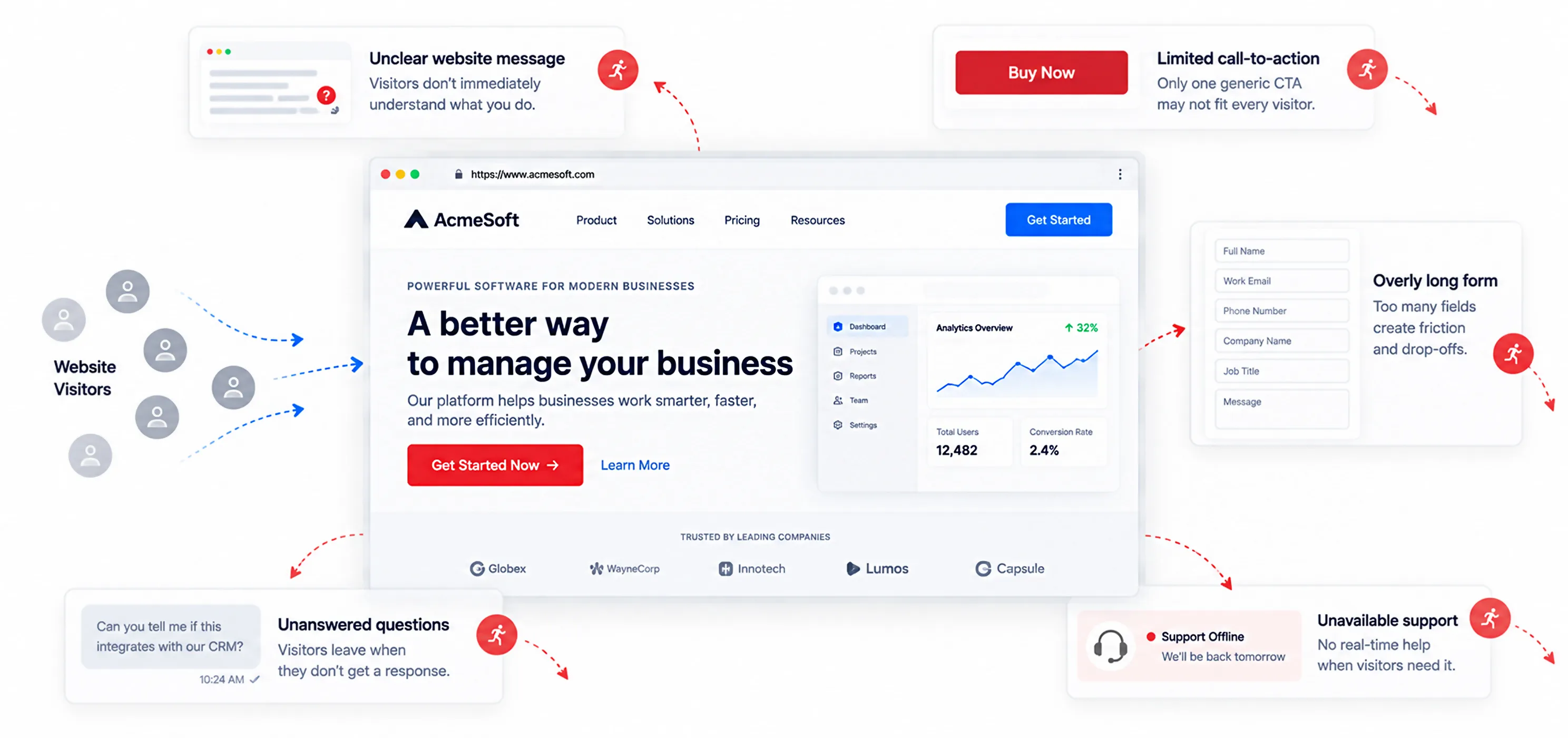
There are really only a handful of reasons someone visits your website and leaves without taking any action. Once you understand them, fixing them becomes a lot more straightforward.
They didn’t understand what you do fast enough
You have about 8 seconds to tell a visitor what you do, who it’s for, and why they should care. If your homepage opens with a vague slogan instead of a clear statement, most people simply won’t stick around long enough to figure it out.
They weren’t ready to “buy” yet, and you only gave them one option
Not every visitor is ready to book a call or sign up. Some just want more information. If your only call-to-action is “Buy Now” or “Book a Demo,” you’re accidentally filtering out everyone who isn’t at that exact stage yet.
The form felt like a chore
Long forms with ten fields, a mandatory phone number, and a CAPTCHA that fails twice, these are silent lead killers. Every extra field you ask for is one more reason for someone to give up halfway.
They had a question, and nobody answered it
A visitor is comparing you to two competitors. They have one small question — about pricing, about a feature, about how long setup takes. If there’s no fast way to get that answer, they simply go check the competitor’s site instead.
They showed up outside business hours
A huge chunk of your best, most serious visitors browse in the evening, on weekends, or from a completely different time zone. If nobody and nothing is there to engage them, they move on and rarely come back.
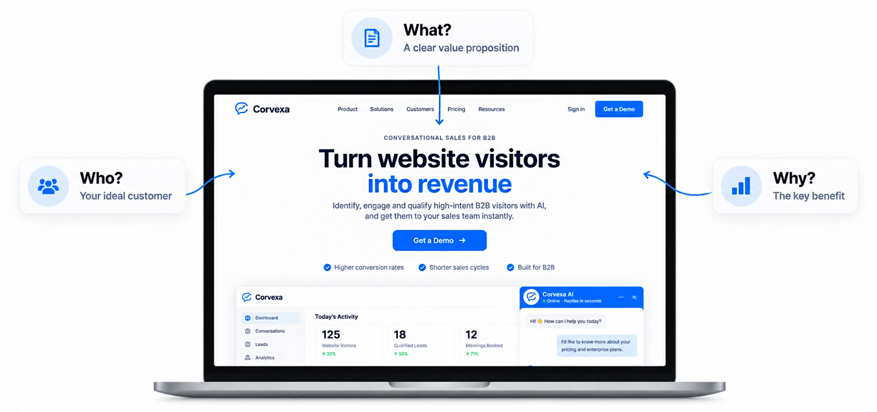
This is the single highest-leverage fix on this entire list, and it costs nothing but a rewrite.
Your homepage headline should answer three questions in the first five seconds: What is this? Who is it for? Why should I care right now? If a visitor has to scroll and think to figure out what you actually sell, you’ve already lost a good chunk of them.
A simple formula that works well: What you help people do] for [who you help], without [the pain they’re trying to avoid
For example: “Turn website visitors into qualified leads, without hiring more salespeople.” That’s it. Clear, specific, no buzzwords.
Quick checklist for your homepage
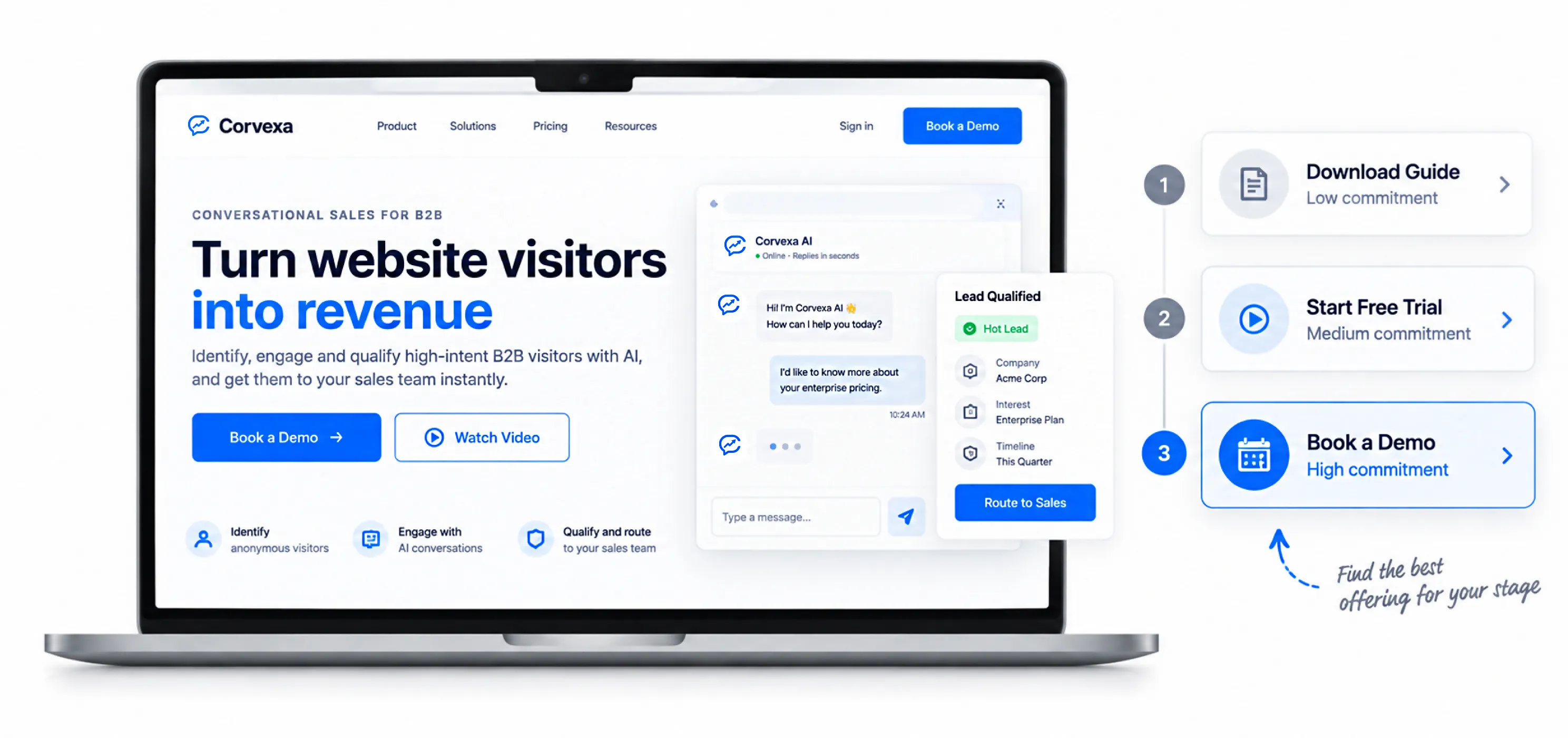
Not everyone who’s interested in your product is ready to talk to sales. Some people want to poke around a little first. If “Book a Demo” is the only button on your site, you’re losing everyone who isn’t at that exact decision stage.
Instead, offer a small ladder of options, from low-commitment to high-commitment:
This does two things. First, it captures people earlier, before they’re ready to buy, so you can nurture them over time. Second, it tells you something valuable about each visitor; someone who downloads a guide is a very different lead than someone who books a call the same day.
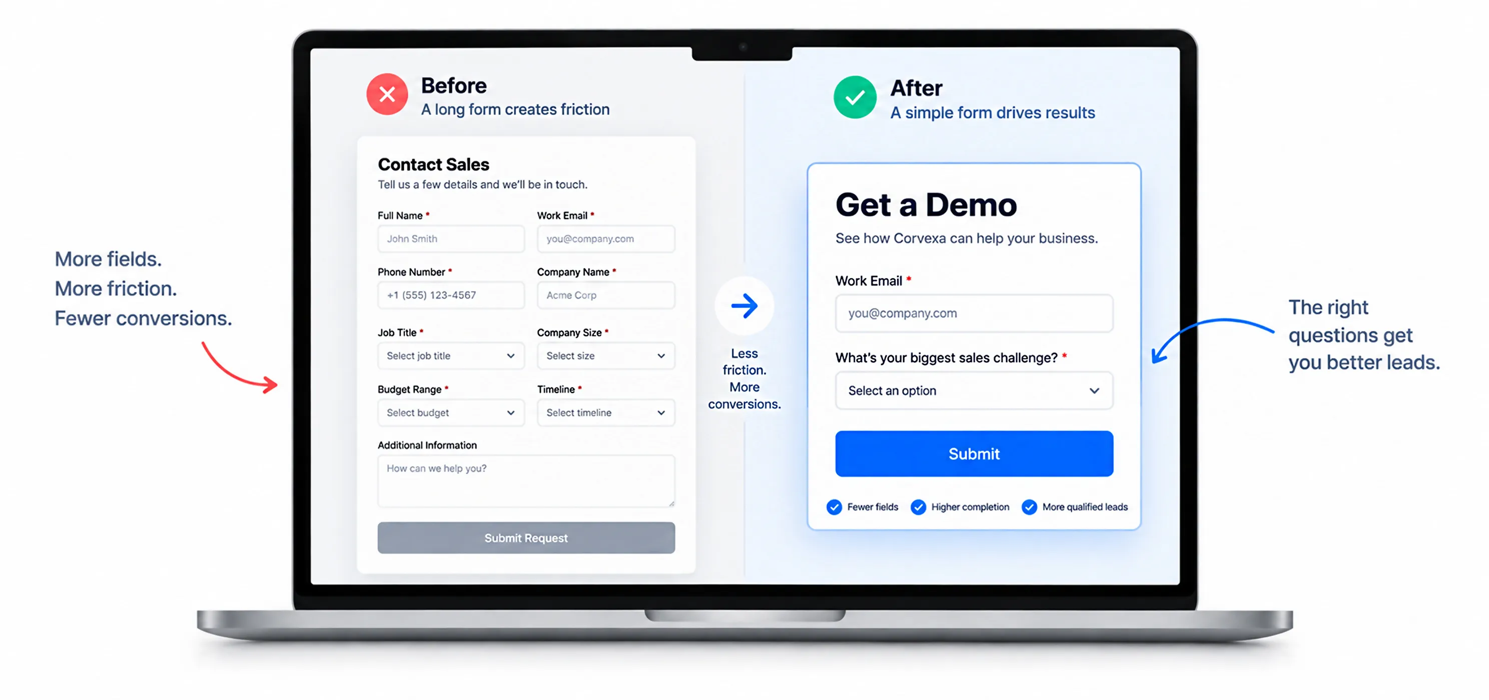
Every field you add to a form is a small tax on your conversion rate. Name, email, phone, company, job title, company size, budget, timeline… by the time you’re done, you’ve built a wall, not a form.
Here’s a simple rule: ask only for what you need to take the very next step. If your next step is “send a follow-up email,” you need an email address. That’s it. You can ask for the rest later, once trust has already been built.
| Instead of asking for… | Try this |
| Full name, email, phone, company, job title, budget | Just email (or email + one qualifying question) |
| A dropdown with 20 industry options | A short free-text field, or skip it entirely at this stage |
| Mandatory phone number | Optional phone number, requested only for hot leads |
If you genuinely need more information to qualify a lead, don’t put it all in a form. Get it through a conversation instead, which brings us to one of the most effective changes you can make.
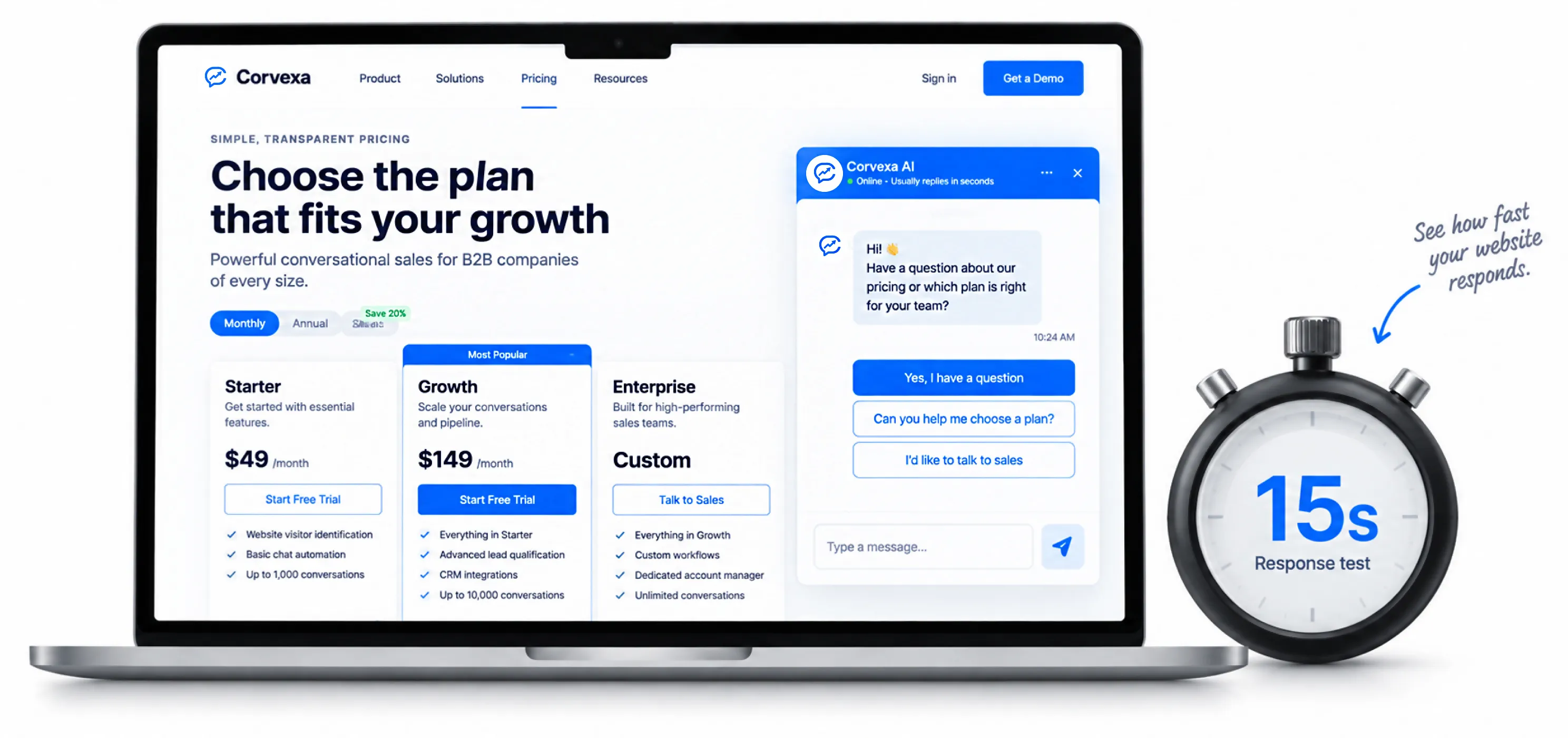
Here’s the thing about forms: they only catch people who have already made up their mind. Everyone who’s still deciding, still comparing, still has one small question they just leave, silently, and you never even know they were there.
This is where a live chat, or better, an AI-powered conversation on your site, changes the math completely. Instead of waiting for a visitor to fill something out, you proactively start a conversation the moment you notice buying signals someone lingering on your pricing page, or clicking around your features for the third time.
The visitor gets an instant answer to their question. You get a name, an email, and some context about what they actually care about, all without them ever feeling like they filled out a form.
| Simple test: Open your own website right now on your phone. Wait 15 seconds. Does anything happen? If the answer is “nothing,” you have a silent visitor problem, and it’s costing you leads every single day. |
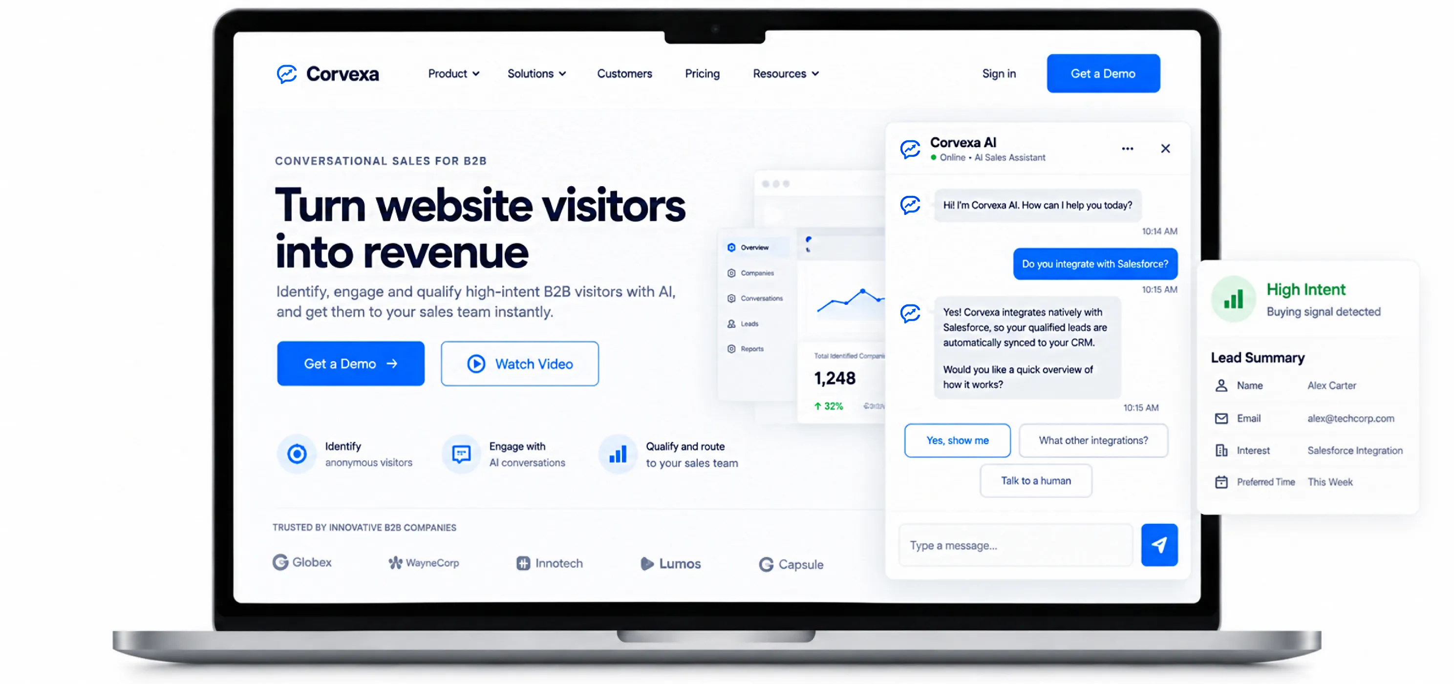
This is exactly the gap that a tool like Corvexa is built to close. Corvexa is an AI sales agent that sits on your website and works the way a good salesperson would it notices when someone is showing real buying intent (checking pricing, comparing you to competitors, reading a case study) and starts a natural conversation before that visitor gets a chance to quietly leave.
Instead of a static contact form, Corvexa has a real conversation, answers questions using your own website content and documents, and quietly collects the details that matter name, email, interest, and preferred time to talk — without it ever feeling like an interrogation. Every conversation gets scored automatically as High, Medium, or Low intent, so your sales team knows exactly who to call first.
A few things worth knowing if you’re considering it for your own site:
The point isn’t that a chatbot alone fixes lead conversion nothing here works in isolation. But pairing a clear homepage, a short form, and real-time engagement (whether that’s a human, a tool like Corvexa, or both) is what actually closes the gap between “visitor” and “lead.”
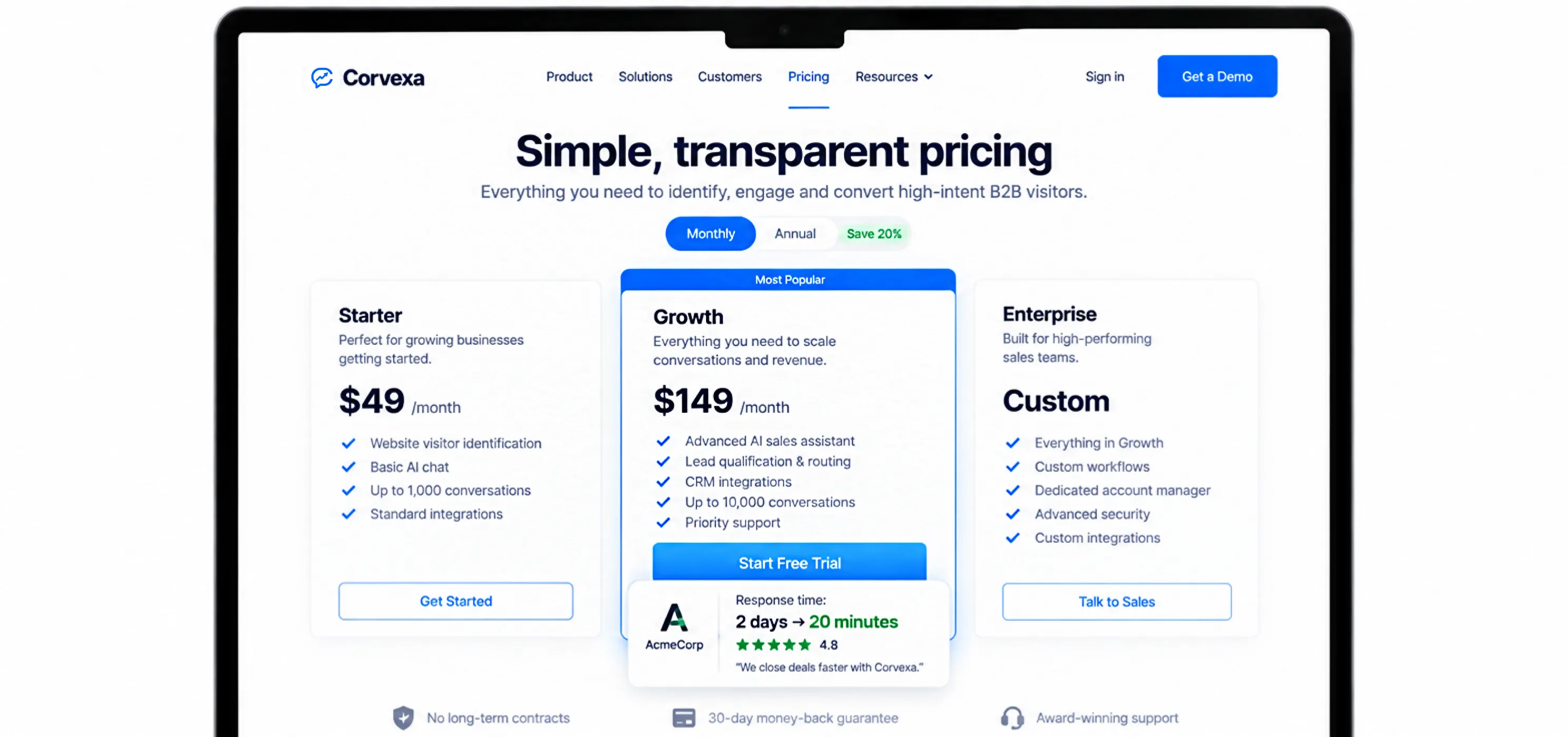
Most websites hide their best trust signals on a separate testimonials or case-studies page that almost nobody visits. Meanwhile, the pages where people are actually making a decision your pricing page, your homepage, your signup page often have none at all.
Move your proof to where the decision actually happens:
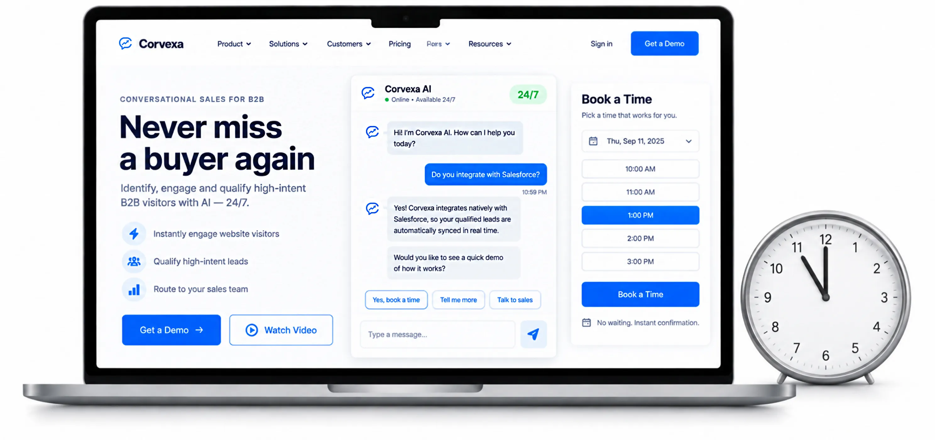
Your best prospects don’t necessarily browse during office hours. A founder comparing tools might be doing it at 11pm after putting the kids to bed. A procurement manager might be researching over the weekend before Monday’s meeting.
If your only way to engage a visitor is “someone from our team will get back to you,” you’re losing every visitor who shows up outside your working hours — and that’s often a large share of your most serious, most researched buyers.
A few ways to close this gap without hiring a night shift:
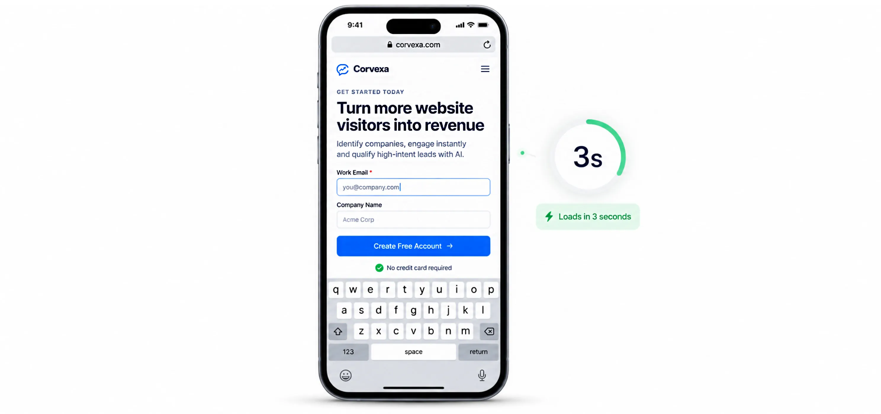
A huge share of your traffic is arriving on a phone, often while doing something else waiting in line, on a commute, half-watching TV. If your site is slow to load, hard to tap, or the form is a nightmare to fill out with a thumb, you lose these visitors before they even get a chance to consider you.
Quick mobile checklist
Test this yourself. Literally open your own site on your phone, on mobile data (not wifi), and try to complete your own signup or contact flow. If it frustrates you, it’s frustrating your visitors too.
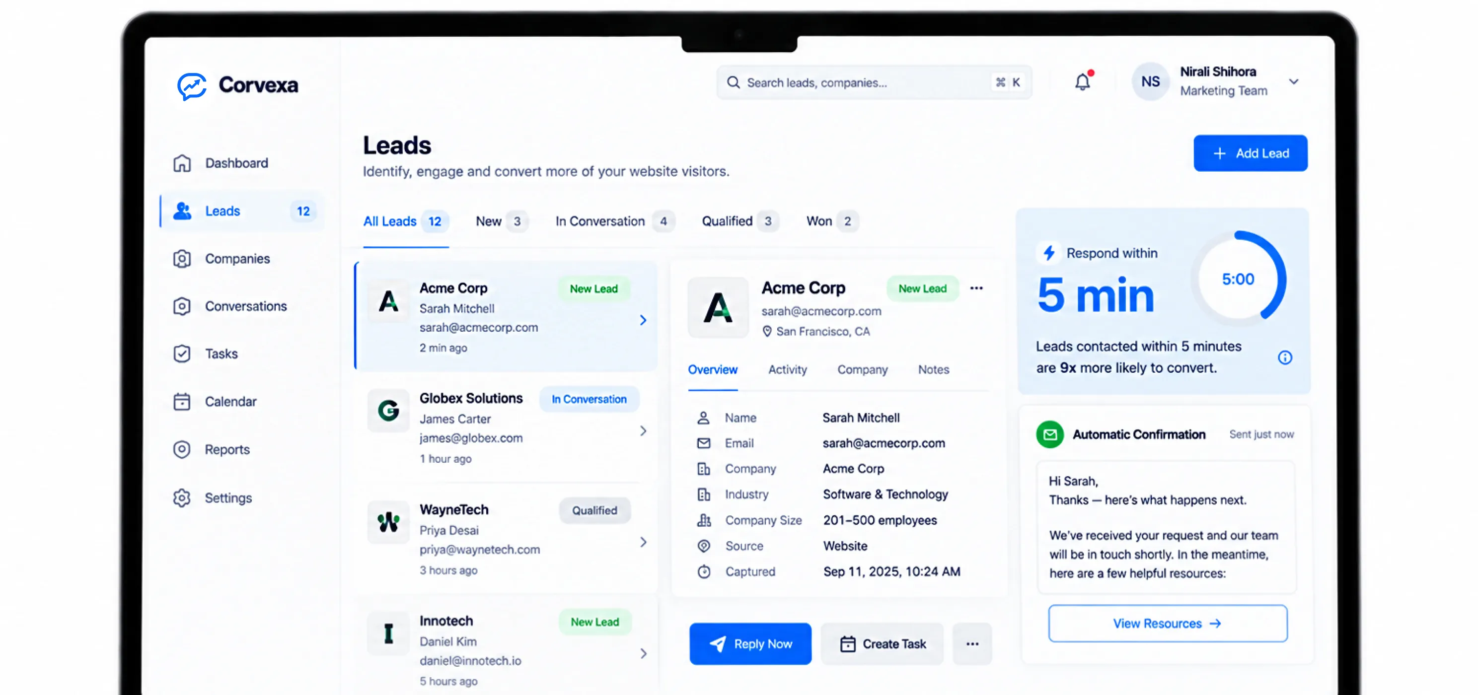
Getting someone to give you their email is only half the job. What happens in the next 5 minutes, and the next 5 days, decides whether that lead actually turns into a customer.
The first 5 minutes matter more than you think
Studies on response time consistently show the same pattern: leads contacted within the first few minutes are dramatically more likely to convert than leads contacted even an hour later. Speed isn’t a nice-to-have here it’s often the single biggest lever you have.
Build a simple follow-up rhythm
Not every lead responds to your first message. That’s normal. Build a light follow-up sequence instead of giving up after one email:
You don’t need a complicated analytics setup to improve conversion. A handful of simple numbers, tracked consistently, will tell you almost everything you need to know.
| Metric | What it tells you |
| Visitor-to-lead rate | What percentage of visitors take any action at all |
| Bounce rate on key pages | Where people are leaving without exploring further |
| Form completion rate | Whether your form itself is the bottleneck |
| Time to first response | How fast you’re following up on captured leads |
| Lead-to-customer rate | Whether your leads are actually the right kind of lead |
Pick one number to improve at a time. Trying to fix everything at once usually means nothing actually gets fixed. Start with whichever page has the most traffic and the worst conversion rate; that’s almost always where your biggest, fastest win is hiding.
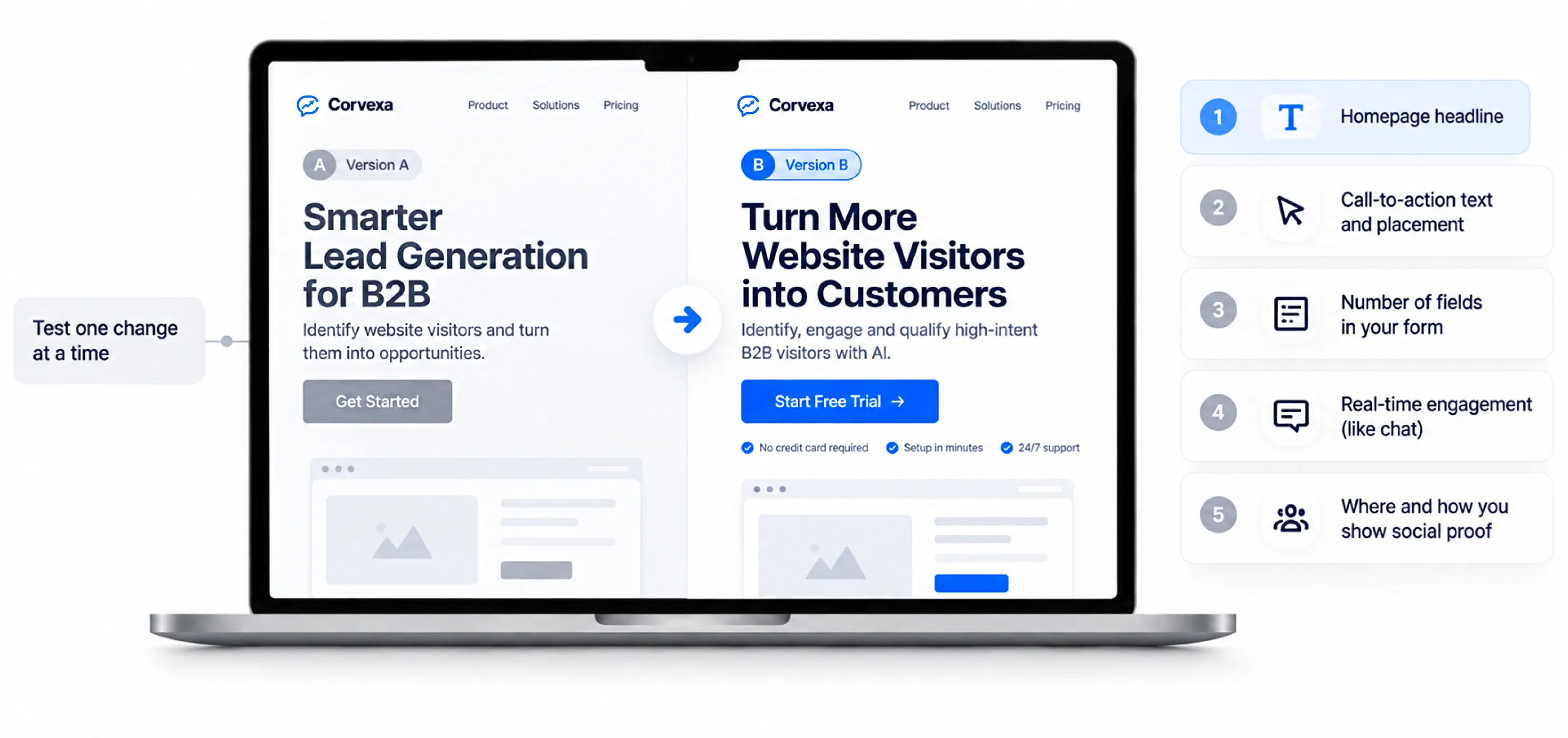
You don’t need a fancy A/B testing tool to get started. Even simple, sequential testing change one thing, watch it for two weeks, compare will teach you a lot.
Good things to test, in rough order of impact:
Resist the urge to test five things at once. You won’t know which change actually made the difference, and you’ll end up making decisions based on noise instead of real signal.
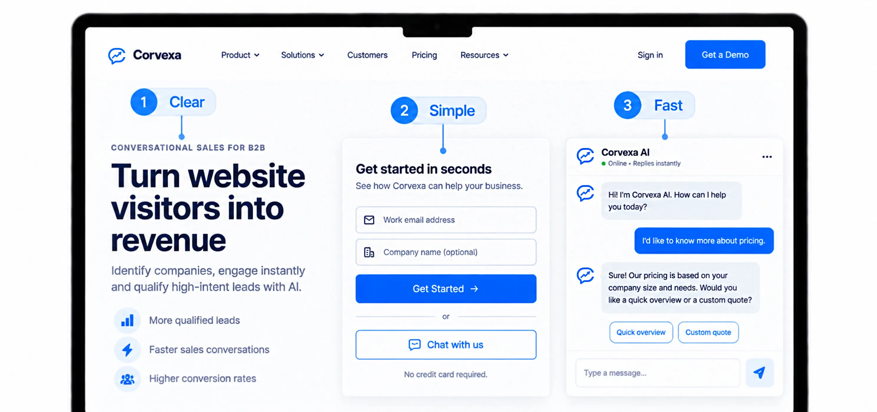
None of this requires a bigger budget. It requires paying closer attention to the visitors you’re already paying to attract, and closing the small gaps where they quietly slip away.
If you only do three things after reading this, make it these:
Fix these three, and most businesses see a meaningful jump in leads within a few weeks, without spending anything extra on ads. The traffic is already there. Your job now is simply to stop losing it.
 How to Increase Website Lead Conversion Without Ads
Live chat, chatbots, popups, session replay, AI conversational agents the category is crowded, and the feature lists all start to...

Here’s a guide to the marketing shift that’s quietly changing how B2B companies fill their pipeline Somewhere on your website,...

Most B2B websites get plenty of visitors who never fill out a form. They browse product pages, read case studies,...